The Layout tab in the Snapshots macro configuration controls how the snapshot is rendered on the Confluence page. Most options are toggles that you can mix and match; defaults are sensible for a typical page viewer, so you only need to change them when the snapshot needs to look or behave differently.
This page is a reference for the options on the Layout tab. Three of them — Snapshots scrolling, Empty level placeholder, and the Grouping defaults — link out to other pages where the full workflow lives.
To open the Layout tab, edit the page, open the macro configuration, and switch to the Layout tab.
General display options
These appear at the top of the Layout tab.
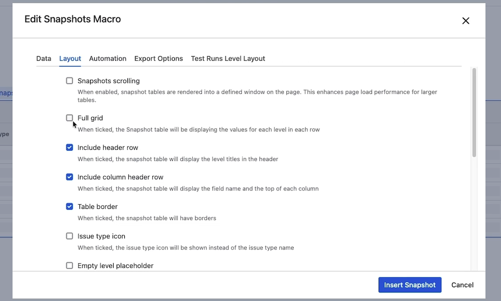
Snapshots scrolling
When enabled, snapshot tables are rendered into a fixed-height window on the page. This improves page load performance for large tables. The page viewer scrolls within the snapshot rather than scrolling the Confluence page through every row. See Snapshots scrolling for large pages for when to use it and how to set the site default.
Full grid
When ticked, the snapshot displays the values for each level in every row. By default, level-1 cells (and other parent cells) are merged across the rows of their children, so each parent value appears once. With Full grid ticked, those parent cells are duplicated on every row, producing a fully populated grid where each row carries a complete set of values from level 1 through to the deepest level.
Use full grid when the snapshot will be exported to Excel and the page viewer expects to filter, pivot, or otherwise manipulate rows individually.
Include header row
When ticked, the snapshot table displays the level titles in the header band above the column titles. Untick to hide the level titles — for example, when the level structure is implicit and the titles would be redundant.
Include column header row
When ticked, the snapshot table displays the field name at the top of each column. Untick to hide the column names.
Most page viewers expect column headers; hiding them tends to confuse. Consider carefully before unticking.
Table border
When ticked, each cell of the snapshot table has a thin border. Untick for a cleaner, borderless look.
Issue type icon
When ticked, columns that show the issue type display the Jira icon (matching how the type appears in Jira). When unticked, the cell shows the type name as text.
The text view is preferable when icons render poorly — for example, in PDF exports of certain styles, or when page viewers find the type label easier to scan.
Empty level placeholder
When ticked, levels that have no children for a given parent are rendered with placeholder text instead of being shown as empty. Edit the placeholder text in the field below the toggle.
For the full workflow, including field-level placeholders (configured separately in the field list), see Using placeholders.
Source info
Display information about the Jira source data. Two settings live in this section.
Show JQL query
When ticked, the JQL string used to retrieve the data appears in the table header for each level. Useful for transparency — page viewers can see exactly which Jira query produced the data — but most snapshots are clearer without the JQL on display. Reach for this option when the audience is technical and the search criteria are part of the report.
Auto-detect issue keys
When ticked, Snapshots scans cell text for strings that match the Jira issue-key pattern (letters, dash, digits — for example, GAL-26) and converts them to hyperlinks pointing at the corresponding Jira issue. This applies most commonly to free-text fields like Description.
The Key field itself is unaffected by this option — it always renders as a hyperlink regardless of this setting.
Untick this option if your data contains strings that match the key pattern but aren't actually Jira keys; the hyperlinks would be wrong and confusing.
Grouping defaults
Grouping is supported on one column from level 1 only. The grouping field itself is configured by hovering over the field in the level-1 field list (see Grouping rows by a field). The two settings here control how that grouping renders on the page.
Expand all
Controls whether groups appear expanded or collapsed on page load. When ticked, every group is expanded and all rows are visible. When unticked, each group renders as a single header row that the page viewer clicks to expand.
Use the collapsed default for long tables that page viewers scan; the expanded default for short tables where grouping is just an organizing aid.
Show group column
When ticked, the field used for grouping also appears as its own column in the table. When unticked, the column is hidden — useful for keeping wide tables narrower, since the group header already shows the value.
Save and view
Click Insert snapshot and republish the page. Most layout options apply immediately — you do not need to take a new snapshot, because layout doesn't affect what data was captured.
The exception is Show group column (above), which affects the export and therefore requires a new snapshot.
What's next
-
Snapshots scrolling for large pages — when a snapshot has too many rows for a single page render.
-
Using placeholders — fill empty cells (per field) and missing levels (Layout tab) with explicit text.
-
Grouping rows by a field — choose which field groups the table.